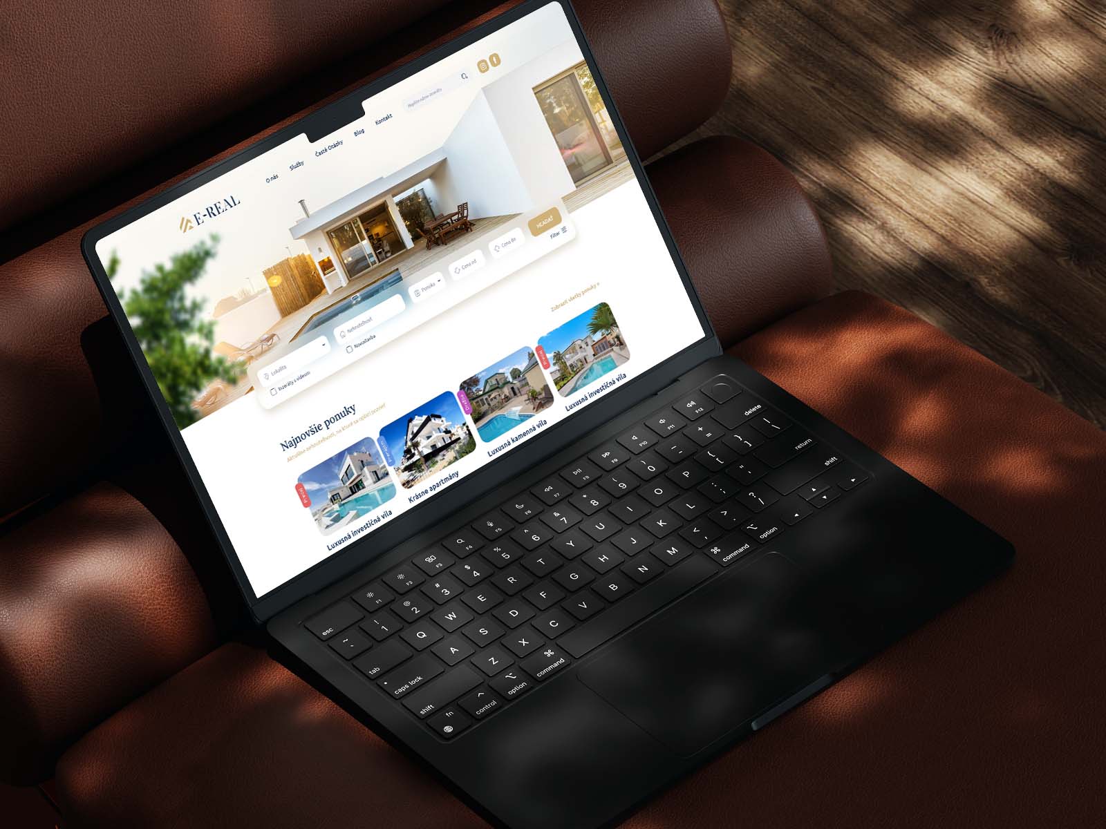
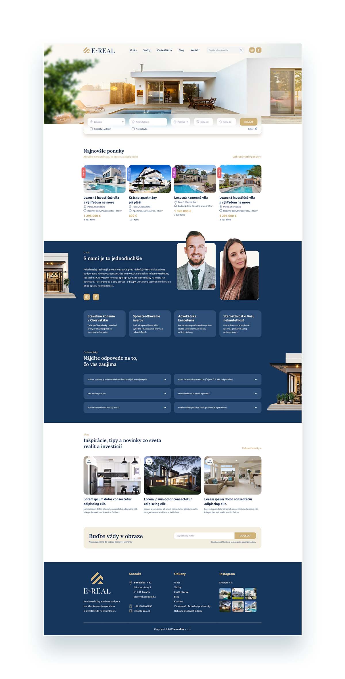
Given the premium nature of the properties, the visual direction emphasizes elegance and clarity. The layout balances showcasing selected listings with informative content that explains the buying process and services involved. The design follows the established brand identity, using a primary blue color complemented by subtle gold accents.
As I was also involved in the branding phase, the design was approached holistically from the start, ensuring visual consistency and a clear direction across all touchpoints of the project.