Project Overview
As the client did not have a fixed visual direction at the beginning, the process started with deeper research into her field and philosophy.
Kinezis works with Access Bars and Fen Kinesiology techniques, which aim to release mental blocks, reduce stress, and support positive life changes. Understanding these principles was essential in order to translate them into a visual language that feels calm, meaningful, and trustworthy.
The main challenge was to design a logo that communicates harmony, balance, and inner calm without feeling abstract or unclear. Since the brand operates in a sensitive and holistic field, the visual identity needed to feel gentle, welcoming, and non-aggressive, while still remaining professional and distinctive.
Another important objective was to subtly reflect the core concept of Access Bars, which is based on 32 points on the head, without making the symbolism overly literal.
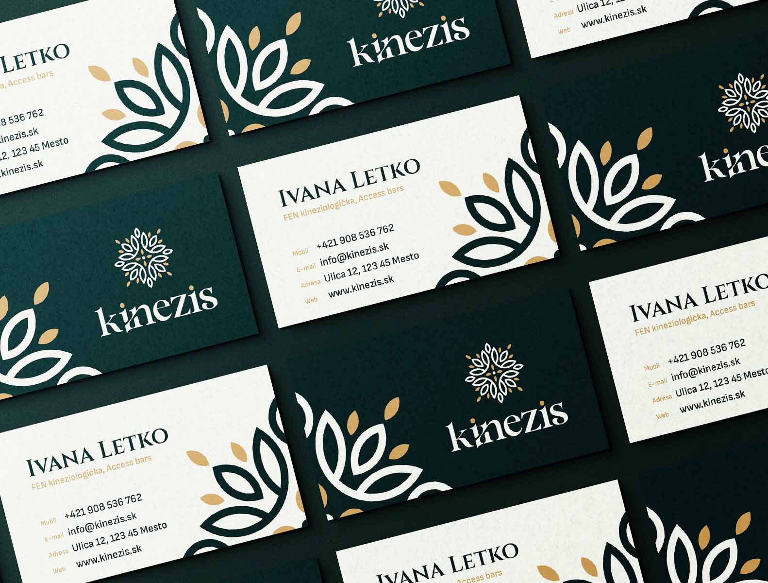
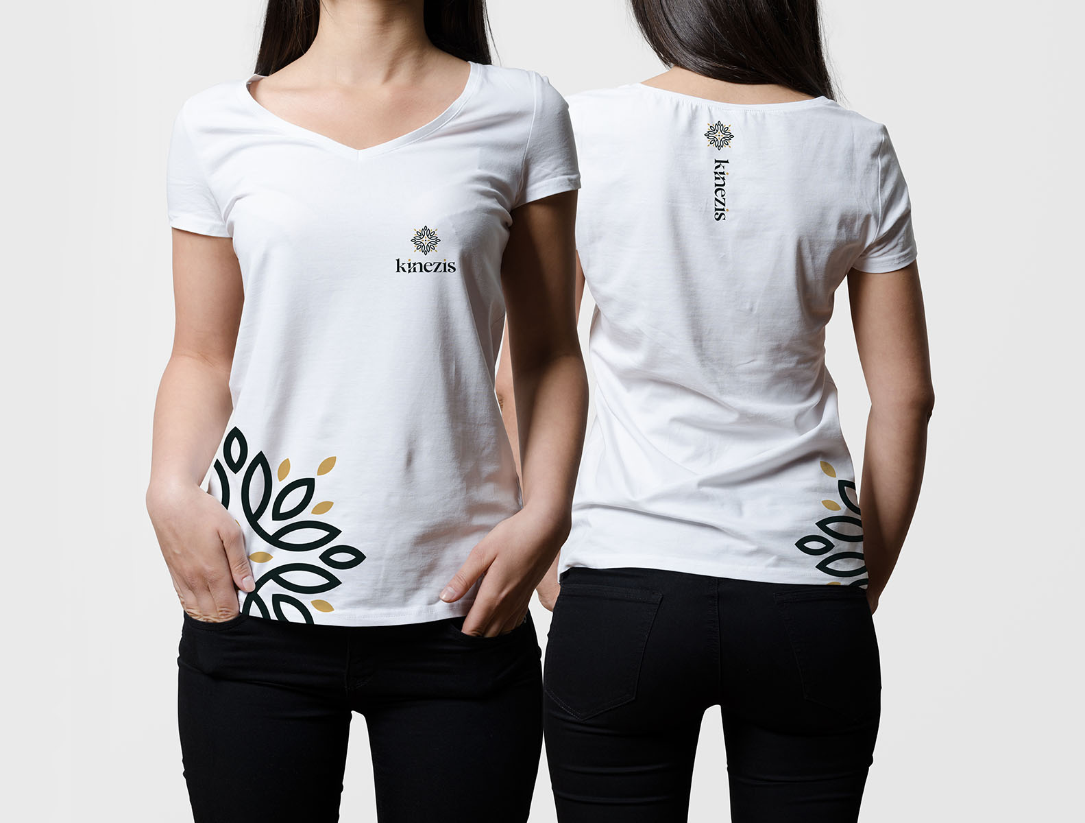
The logo mark is inspired by a floral form composed of 32 individual elements, directly referencing the 32 Access Bars points. This structure brings meaning into the design while remaining visually soft and organic. Symmetry plays a key role in the logo, symbolizing balance, alignment, and inner harmony. The overall form is calm and centered, reinforcing a sense of stability and equilibrium.
The color palette is earthy and natural. Deep green was chosen as the primary color to evoke grounding, growth, and connection to nature, while subtle gold accents add warmth and a sense of value without overpowering the design.
The final result is a serene and thoughtful visual identity that reflects the essence of Kinezis – a space for balance, release, and positive change.