Project Overview
The Amata branding project was created for a client offering Head SPA services – a ritual focused on deep relaxation, care for both body and mind, and a sense of inner balance. From the beginning, the collaboration was built on trust, with the client providing only minimal direction and allowing me a high degree of creative freedom. This approach gave space to shape the brand thoughtfully and with intention, while respecting the calm and intimate nature of the service itself.
The main objective was to create a visual identity that feels soothing, elegant, and timeless, while avoiding anything overly expressive or distracting. The brand needed to communicate calm, care, and professionalism, and at the same time subtly reflect the origins of Head SPA without relying on obvious or literal symbolism.
It was important for the logo to feel gentle and inviting, yet refined. Balance between relaxation and premium quality.
Head SPA, as it is known today, originates from Japan, a fact that deeply inspired the design direction of this project. Rather than referencing this heritage directly, I chose a subtle and respectful approach, allowing the influence to be felt rather than seen.
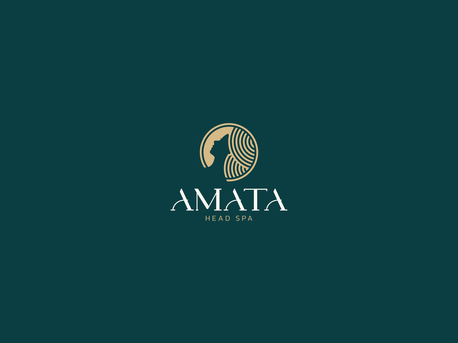
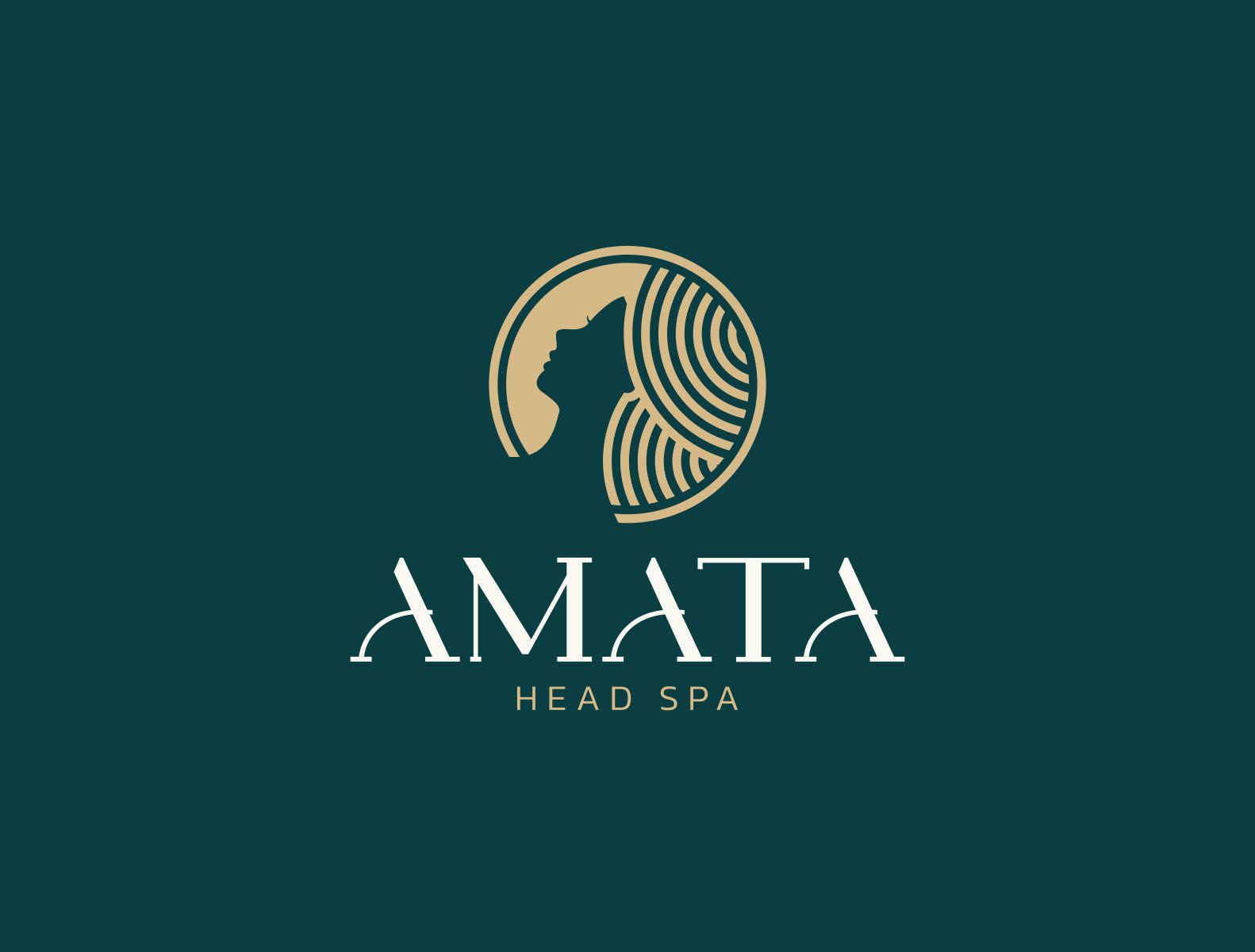
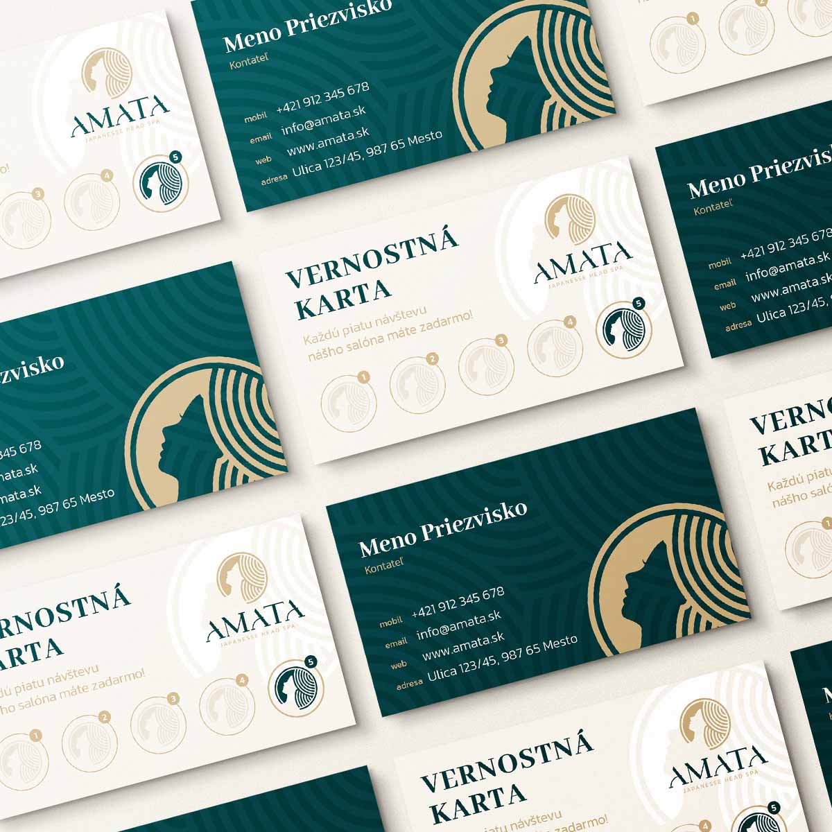
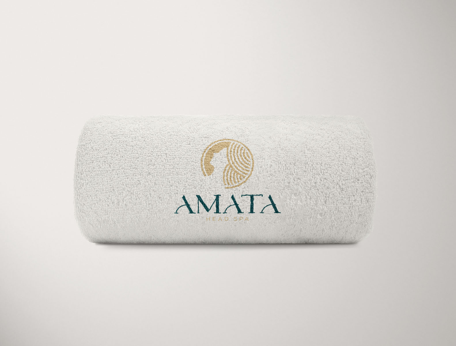
The logo is built around soft, rounded, almost circular lines, inspired by the shape and movement of the Head SPA device itself, which releases gentle streams of warm water. This circular form symbolizes flow, continuity, and calm energy.
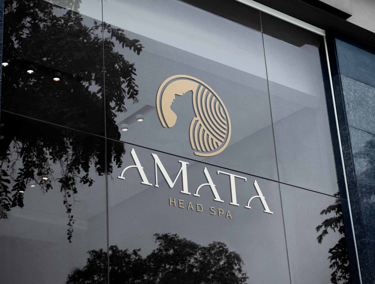
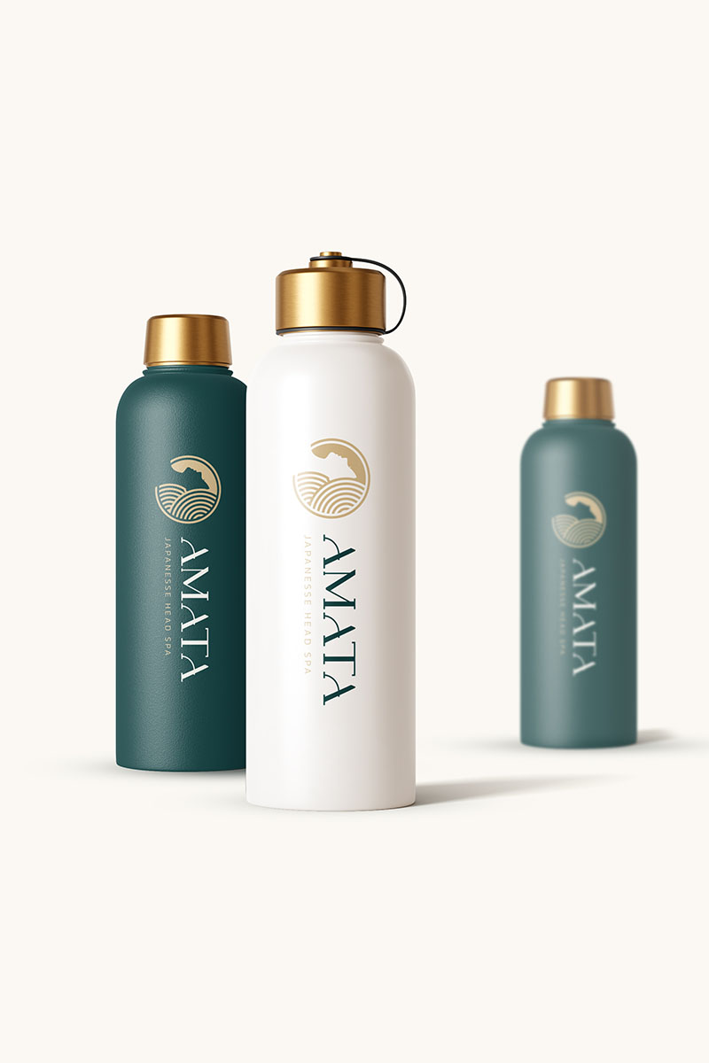
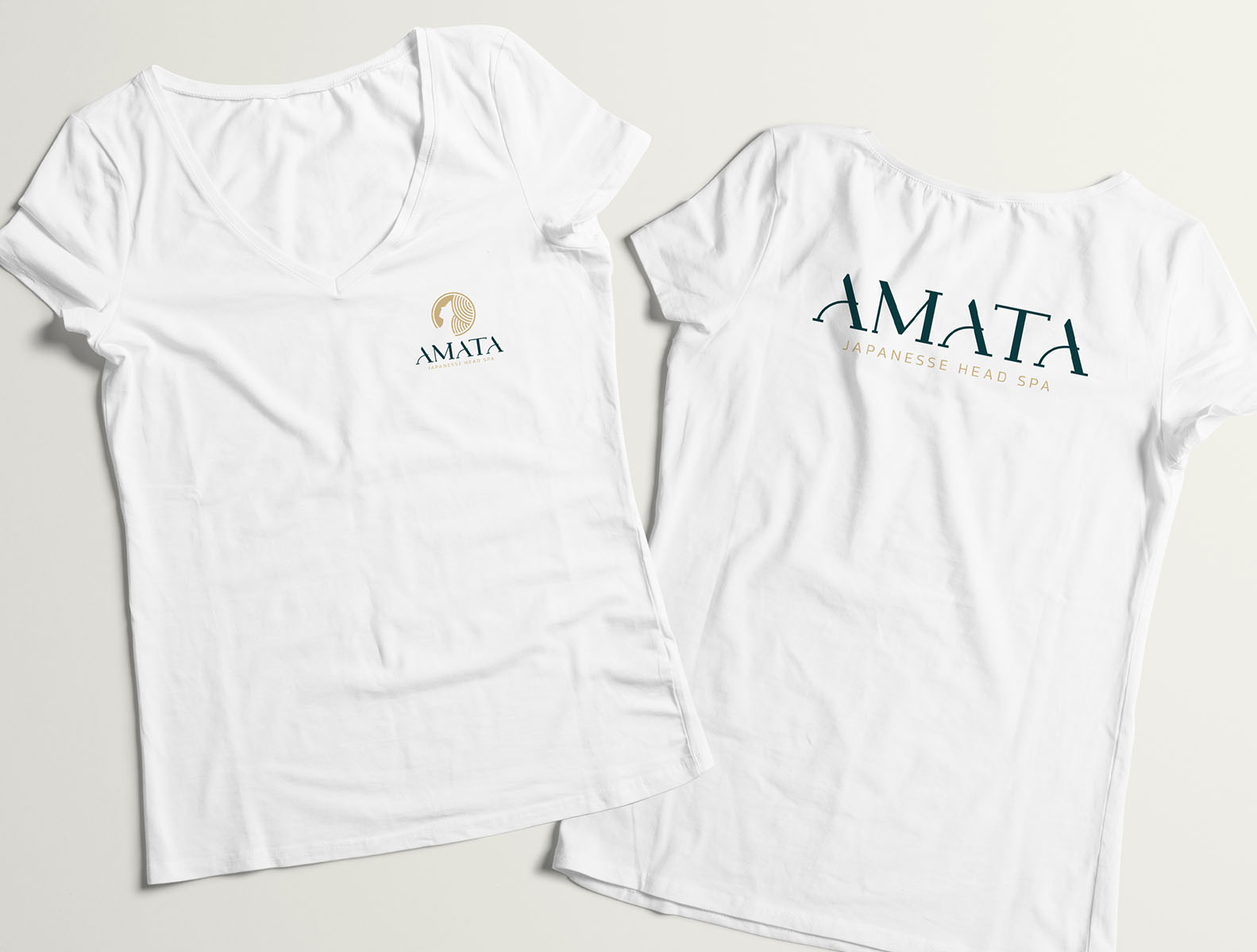
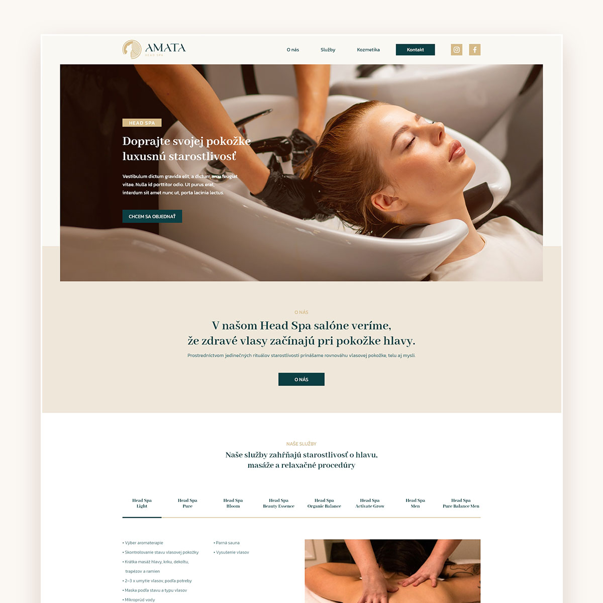
A serif typeface was selected to add a sense of elegance and quiet sophistication, while the color palette combines emerald green with gold tones. Together, these colors evoke balance, renewal, and a premium yet natural feeling.
The result is a brand identity that feels calm, considered, and harmonious – reflecting Head SPA not just as a service, but as a restorative ritual.